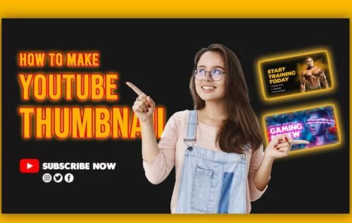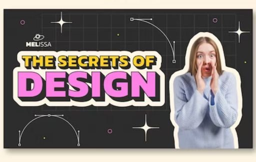


Thumbnails are one of the most important elements of a successful YouTube video. With over 500 hours of video uploaded to YouTube every minute, thumbnails play a critical role in grabbing viewers' attention and getting them to click on your video. So how exactly do top YouTubers create effective, clickable thumbnails that convert viewers?
In this comprehensive guide, we'll break down the key strategies and tools you need to know to make stunning YouTube thumbnails that will boost views and engage your audience.
On YouTube, first impressions matter. With so many videos competing for attention, if your thumbnail doesn't immediately catch the viewer's eye, they'll likely skip right over your content.
Some key reasons why optimizing your YouTube thumbnails is essential:
Simply put: YouTube thumbnails are visual advertising for your videos. Taking the time to create great thumbnails will directly translate into more views, subscribers, and traffic to your channel.
Successful YouTubers follow certain best practices when designing their thumbnails. Here are the key strategies they use:
The foundation of every good thumbnail is an interesting, high-quality image that grabs attention. Avoid cheap stock photos or grainy screenshots from your video. Work with a designer to create custom images, illustrations, or graphic assets tailored specifically for your brand and niche.
Many top YouTubers even do professional photoshoots to get graphic assets made just for thumbnails. This investment in custom images makes their thumbnails stand out in a sea of stock photography.
Using a popular face helps turn heads in YouTube search results. Close-up expressive faces tend to perform best. This could be your own face if you're the host or a well-known figure related to your video topic.
For example, a reaction face showing excitement and surprise will pique interest in tutorial videos. Comedians often use an exaggerated laughing face. Adding your own face helps build brand familiarity with viewers.
The text elements of your thumbnail including the title, subtitles, or slogans must instantly communicate what the video is about while inciting intrigue.
Use simple, bold text that is easy to read in small sizes. Write titles and descriptions focused on the viewer - for example, "10 iPhone Tricks You Haven't Heard Of" rather than "10 iPhone Tricks."
Ask a question, use humor, surprise the viewer - do whatever helps compel them to click and watch your video.
Avoid cluttered or confusing designs. Arrange text and elements in clean, organized layouts. Use consistent branding colors, fonts, and styles that match your YouTube channel art.
Many YouTubers use professional graphic designers to handle their thumbnails and branding for a polished look. Even if you design your thumbnails yourself, analyze what works well for top channels in your niche and apply those best practices.
Try multiple thumbnail variations when uploading each video and use YouTube Analytics to see which performs better. This allows you to refine what works over time.
Change up the positions of headline text or try different colors, backgrounds, and graphic elements. You can A/B test thumbnails to determine the optimal design.

Ready to create stunning thumbnails that convert viewers? Follow these steps:
Analyze top channels that create content similar to yours. What do their best-performing thumbnails have in common? Look for patterns in images, text, colors, and layouts that capture your attention or emotions. Take note of what works well.
As discussed above, start with an eye-catching, professional image asset that is relevant to your video topic. Work with a graphic designer if needed.
Ideally, focus on a bold image of a face or something visually striking like an energetic action scene. The image should take up the majority of space in the thumbnail.
Once you have a strong base image, use an image editing tool like Canva or Photoshop to add overlays with your channel's branding colors, fonts, logos, and style elements. This instantly distinguishes your thumbnail.
You can also add graphic assets like badges, stickers, frames, or illustrations that complement your brand identity. Maintain clean organization without overcrowding the design.
Now craft your main headline or video title - this is the hook that convinces the viewer to watch. As discussed earlier, intrigue the viewer with surprise, humor, curiosity, or shock value.
Use contrasting colors that make the text pop against the background image. Place it prominently near the top or bottom of the thumbnail space.
Include supplemental text below the main headline to further explain the concept or topics covered in the video if relevant. You can also tease the viewer with phrases like "You won't believe what happens next!"
Keep text short, simple, and bold. Allow adequate spacing between text elements so the thumbnail doesn't look too crowded or busy.
YouTube recommends a minimum thumbnail resolution of 1280 x 720 pixels. Use image editing tools to resize your finished thumbnail to these dimensions without distorting or losing quality.
Export the image as a . JPG or. PNG file at 80% quality or higher. The final file size should be under 2 MB. Lower-quality thumbnails will look fuzzy on YouTube.
With different variations completed, upload your video draft on YouTube then add and select your custom thumbnail. If needed, swap between versions to A/B test which drives more clicks.
Use YouTube Analytics to compare thumbnail performance over time. Refine your strategy based on hard data on what's effective at getting views. You can download YouTube thumbnails of other YouTubers to get an idea of how to make stunning YouTube thumbnails.
You don't need fancy design skills to make great DIY thumbnails - the right tools can help anyone quickly create pro-level results. Here are the best apps and software options:
Canva makes beautiful thumbnail designs completely free and easy, even for beginners. It offers a drag-and-drop interface with customizable templates plus millions of free photos, graphics, icons, and fonts to polish your brand. It's by far the fastest way to make YouTube thumbnails without needing design expertise.
The most powerful editor for photo manipulation and compositing. While complex for beginners, Photoshop offers unparalleled control over images and text. It's the top choice for professional designers. The learning curve is steep but it's worth it for top quality thumbnails.
Illustrator allows you to create vector-based thumbnail artwork from scratch. While not as intuitive as Photoshop for editing photos, Illustrator is better for illustration, logo design, and typography. The vectors remain crisp and clear at any size.
A free, open-source alternative to Photoshop with advanced capabilities. The interface is dated but it offers many similar tools for professional image editing, retouching, and graphics creation. A good option if you can't afford Adobe Creative Cloud.
PicMonkey is an easy yet powerful cloud-based image editor. It offers beautiful templates, graphics, and fonts along with intuitive editing tools. Less robust than Photoshop but more user-friendly for beginners. Perfect for basic thumbnail editing needs.

Ready to start designing custom thumbnails that help your YouTube videos stand out? Keep these essential tips in mind:
Remember, your thumbnails represent your brand on YouTube. Take the time to create designs tailored specifically to your channel niche and style.
Analyze performance and continuously refine what resonates with your audience. With these tips and the right tools, you'll be making clickable thumbnails like a top YouTuber in no time!
A: Follow these best practices: use high-quality custom images, include an interesting face, optimize text to intrigue the viewer, maintain a professional style, and A/B test different versions. Invest in great graphics, bold colors, and organized designs tailored to your niche.
A: Use graphic design apps like Canva, Photoshop, or PicMonkey. Start with a high-res base image, add brand elements and text, resize to at least 1280x720 pixels, then export as JPG or PNG at 80% quality or higher (under 2 MB).
A: In your design app, add a text layer overlay on top of the image, customize the text color, size, and font, and then position it as desired. Keep the headline short, bold, and high-contrast. Add supporting text sparingly without overcrowding.
A: Effective thumbnails use eye-catching images, intriguing faces, bold contrasting text, clean designs, bright colors, and consistent branding that represents the video concept quickly. They convince the viewer why they should watch.
A: Try a custom illustrated look with original graphic assets, use templates to brand consistently, direct the viewer's eye strategically, take thumbnail photoshoots, and test what pops in search results through A/B testing different versions. Analyze competitors to determine what works in your niche.
Well-designed YouTube thumbnails are crucial to video success. With compelling images, strategic text, and compelling designs tailored to your brand, you can create thumbnails that convert viewers and get clicked.
Use this guide to learn how top YouTubers make professional thumbnails, and follow the step-by-step process to craft effective designs for your own channel.
The right tools, quality graphics, and A/B testing of different versions based on hard data will reveal what resonates best with your audience so you can continually improve.
Remember, your thumbnails represent you on YouTube. Put thought and care into them, and you'll be rewarded with more loyal subscribers, views, traffic, and ultimately higher ad revenue.
What tips do you have for creating clickable YouTube thumbnails? Let us know in the comments below!